| MMv4 KB |
 |
|
|
Your storefront on smartphones & mobile devices |
| Last Edited - 12/21/2011 12:47pm PST | |
| Category Path - Shopping Cart Software Components > Administration Area > Design > FAQs & Tutorials | |
|
| As the use of mobile devices, such as smartphones, continues to grow, it becomes increasingly important to offer a version of your website that is optimized specifically for them and their small screens. This is especially true for online retailers, as some studies suggest that mobile devices will overtake the market by 20151. Following is a tutorial on how to set your storefront to automatically switch to a different design — one that's optimized for small screens — when being browsed by a mobile device. But first, a little background on the problem, and how the Modular Merchant shopping cart software solves it. Smartphones and other devices have ushered in an era of eCommerce on mobile devices, also known as mCommerce2, bringing with them their teeny, tiny screens. To accommodate a smartphone's reduced screen real estate, it's often preferred to create a separate "minimal" version of the online store, shown only to them. 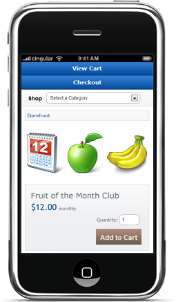 An example of a storefront layout optimized for smartphone users. Modular Merchant can detect the mobile device and automatically switch to this version. In ancient times3, this required hiring either a web developer or tech-savvy djinn to add code to your shopping cart software to "sniff" the device being used, and redirect users of mobile devices to a completely different website; one optimized for their teeny screen. This approach required the store owner to maintain two separate websites, keep them synchronized, and maintain the code to do the switching — and you had to deal with a spiritually ambivalent supernatural creature4. Modular Merchant simplifies this entire process! The shopping cart software includes built-in features to automatically switch to a design that is optimized for smaller resolution screens when it is being viewed on a mobile device — no custom "browser sniffing" code is required. Also, since the regular eCommerce and mCommerce versions of your online store are on the same website, they're always in sync. Maintaining both versions is greatly simplified. Specifying an mCommerce version of a store takes just a few simple steps. Following is a tutorial on how to do just that!
Installing a Template Package optimized for mCommerce
The first step will be to install a Template Package with a layout that has been optimized for use on smaller resolution screens. Users can create their own, or install one provided by Modular Merchant. Since the objective of this tutorial is to get an mCommerce version of the storefront up and running as fast as possible, it will take the approach of installing a Template Package provided by Modular Merchant.
notes
As with all other store Template Packages, it is possible to completely customize the design of the version of the storefront that will be used for mCommerce.
Refer to the tutorial on creating your own Template Package to get started. To install the mCommerce Template Package, follow these steps:
Assign the mCommerce Template Package in the System Settings
Now that the mobile Template Package has been installed, the shopping cart software just needs to be instructed to use it for customers on mobile devices.
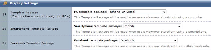 The System Settings can be used to assign different Template Packages to users of PCs, Smartphones and Facebook.
The shopping cart software takes it from there
Once the System Settings have been saved, the shopping cart software will automatically start using the selected Template Package for users of small-screen mobile devices. And, if you want to change the colors, design or layout of the mobile Template Package, it can be edited and rearranged just like any other Template Package. Whether you're working with a standard storefront design, or one optimized for mobile devices, it can be customized to meet your store's specific needs. You can even create your own mobile-optimized store design from scratch. You now have the steps to specify a Template Package for use specifically on smartphones and mobile devices. You're now all ready for mCommerce!
Frequently Asked Questions
which users will view the "smartphone" version of the storefront?
The shopping cart software checks the "user agent" (the type of device) being used by the customer's web browser. Certain device types will trigger the store to automatically switch over to the Smartphone Template Package that has been selected in the System Settings.
User agents that will trigger the switch include: android, blackberry, ddipocket, docomo, iemobile, iphone, j-phone, minimo, nokia, opera mobi, palmos, palmsource, pda, sonyericsson, vodafone, and windows phone. Footnotes 1. http://mashable.com/2010/04/13/mobile-web-stats/ 2. The m either stands for mobile or meshugana. 3. Prior to version 4.111128 of the Modular Merchant shopping cart software. 4. The Djinn, not the web developer. |