| MMv4 KB |
 |
|
|
Customize the tabbed content area of a responsive product template |
| Last Edited - 08/16/2013 2:41pm PDT | |
| Category Path - Shopping Cart Software Components > Administration Area > Design > FAQs & Tutorials | |
|
The responsive template packages produced by Modular Merchant are designed using the Twitter Bootstrap "Fluid layout". This article demonstrates how you can edit the tabbed content area on a product page that uses the Bootstrap framework.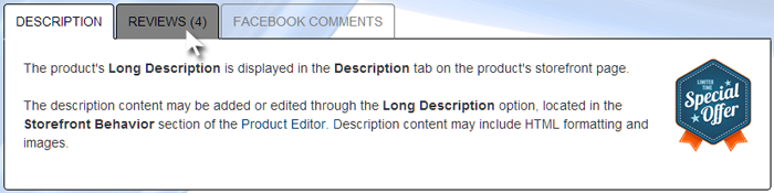
An example of a tabbed content area that uses the style rules from this tutorial.
This article is not meant to be an exhaustive tutorial; its purpose is to provide enough examples to get you pointed in the right direction. There are many different style rules involved in the tabbed content area of the product template. In some template packages, all or most of these style rules have already been added to the template_styles.css stylesheet and are ready to be customized. In other template packages, many of the rules are set in the bootstrap.css and boostrap-responsive.css stylesheets. These stylesheets should not be edited, so in this situation, it would be necessary to first add the style rules to the template_styles.css stylesheet, then customize the rules within template_styles.css.
Style rules for the basic components of the product page tabbed content area
.nav-tabs { } The .nav-tabs style set may be used to specify default style rules for the list that contains the tabs displayed at the top of the tabbed content area. The tabs shown for each product may vary, depending on the specific products settings. Available tabs include "Description", "Additional Info", "Reviews", "Samples", and "Facebook Comments".
example
.nav-tabs {
border-bottom: 1px solid black;
}
This rule specifies that the list containing the tabs will be displayed with a one pixel wide black border along the bottom edge. The bottom edge of the list of tabs is aligned with the top edge of the content area of the active tab, so the bottom border of the tab list gives the appearance of a top border to the tab content area. .nav-tabs > li > a {} The .nav-tabs > li > a style set may be used to specify the style rules for the individual tabs.
example
.nav-tabs > li > a {
color: grey;
border: 1px solid grey;
border-bottom-color: transparent;
}
This set of rules specifies that the individual tabs should each have grey text and a one pixel wide grey border. The bottom border should be transparent, with the result that the black border along the bottom of the entire list will be visible instead. .nav-tabs > li > a:hover {} The .nav-tabs > li > a:hover style set may be used to specify the style rules for an individual tab when the mouse is over it.
example
.nav-tabs > li > a:hover {
color: black;
background: grey;
border: 1px solid black;
border-bottom-color: transparent;
}
This set of rules specifies that when the mouse is over an individual tab, the tab should be displayed with black text on a grey background, and with a black border. The bottom border should be transparent, with the result that the bottom border of the entire tab list is visible instead. .nav-tabs > .active > a, .nav-tabs > .active > a:hover, .nav-tabs > .active > a:focus {} The .nav-tabs > .active > a, .nav-tabs > .active > a:hover, .nav-tabs > .active > a:focus style set may be used to specify the style rules for the active tab, which the tab corresponding to the content currently displayed below.
example
.nav-tabs > .active > a, .nav-tabs > .active > a:hover, .nav-tabs > .active > a:focus {
color: black;
background: white;
border-top: 1px solid black;
border-right: 1px solid black; border-left: 1px solid black;
border-bottom-color: white;
}
This set of rules specifies that the active tab should have black text on a white background, and should have a one pixel wide border at the top, right, and left edges. The bottom border of the active tab should be white, which will overwrite the black border along the bottom of the entire tab list, so that the active tab appears to merge into the the content area below. .tab-content {} The .tab-content style set may be used to specify styles for the main content area of the tabbed section of the product page.
example
.tab-content {
margin-top: -20px;
padding: 20px;
background: white;
border: 1px solid black;
border-top-color: transparent;
-webkit-border-radius: 0 0 4px 4px;
-moz-border-radius: 0 0 4px 4px;
border-radius: 0 0 4px 4px;
}
This set of rules specifies that the content area should have a -20 pixel top margin, so that the top of the content area is aligned with the bottom of the tab list. Additionally, there should be a 20 pixel space between the border and the inside content. The area should have a white background and a black border. The top border should be transparent, so that the bottom border of the tab list is visible instead. The bottom corners should be rounded, with a 4 pixel radius to the curve.
regarding customized html templates
We're always happy to help when we can, but once a template's HTML code has been customized by a third party, troubleshooting those customizations falls outside of what Modular Merchant can provide within our range of free technical support. Fixing larger template issues may require paid development time. We evaluate each request on a case-by-case basis. If a request is so large that it requires a custom web design project to resolve, we will always provide a proposal for the client's approval prior to performing any billable work. |