Modular Merchant's shopping cart software makes it quick and simple to add and customize a slideshow of images to your storefront.
Up to five images may be uploaded to display in the slideshow. The image slideshow components that may be customized include:
-
The slideshow outer container.
-
The slideshow main content container.
-
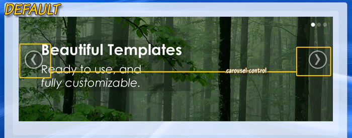
The "bullet" navigation in the upper-right corner of each image, showing which slide the user is currently viewing, and allowing them to jump directly to any slide.
-
The currently displayed image.
-
Left and right arrow buttons, to manually load the previous/next slides.
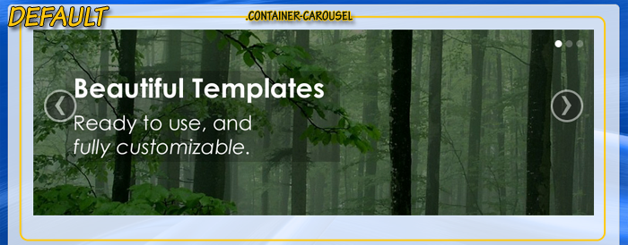
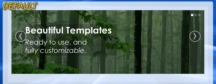 An example of what the responsive template package image slideshow looks like.
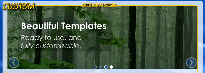
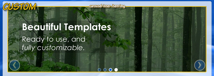
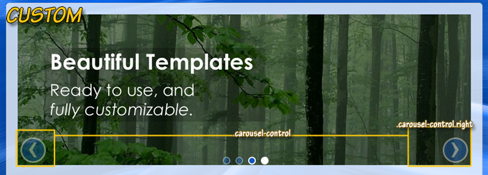
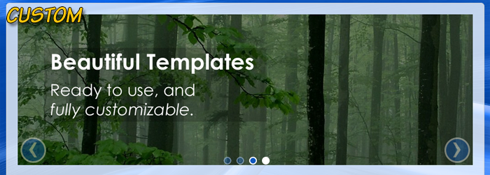 An example of a customized image slideshow.
This article will provide instructions on how to create and customize a slideshow in your online store's responsive template package.
responsive vs standard
The version of the image slideshow that is discussed in this tutorial is only compatible with the responsive template packages that were designed using the Twitter Bootstrap "fluid layout". A slightly different image slideshow may be added to standard, non-responsive, template packages. The image slideshow for standard template packages is explained in detail in the following Knowledge Base article:
Display a slideshow on any store page
Upload slideshow images
The first step to creating your slideshow is to upload the images it will contain. The image slideshow can contain between 1-5 images. These images can be any that you upload. Options for uploading up to five images for the slideshow are located in the Display Settings section of the System Settings at: [Admin > System Settings].
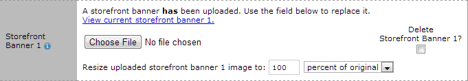 The Storefront Banner System Settings can be used to upload the images that will be used in the Content Slideshow.
Images can be uploaded in .gif, .jpg or .png format.
image sizes
For best results, all of the images used in the slideshow should be the same width and height. If not, the slideshow's content may be cropped or stretched to the size of the first image.
After all of the desired images have been uploaded using the System Settings interface, the slideshow will be ready to use. The next step is to simply tell the shopping cart which page(s) in your storefront you want to display the slideshow on. This is done by adding a QuickCode Tag to the desired location in your store templates.
Display the image slideshow in your storefront
As you know, each page of your public storefront has a corresponding HTML template that controls its design.
Each storefront page has its own template: the store's home page has one, the search page has one, the checkout page has one, etc.
When using one of the responsive template packages, the slideshow can be added to any storefront page by adding the following QuickCode Tag to the desired location on that page's template: {CAROUSEL-BOOTSTRAP}.
The slideshow will be inserted into a page wherever that QuickCode Tag is located within that page's HTML template.
the universe: no assembly required
All of the responsive template packages created by Modular Merchant will already include the {CAROUSEL-BOOTSTRAP} QuickCode Tag on the template for the storefront's home page. In that case, no further customization of templates is necessary.
Also, if you're using the Universal Template system (which allows you to use just one single template to control the design of every page of your storefront) then this QuickCode Tag is already in place on your storefront's home page and is ready to use.
It's not necessary to edit any templates to add this feature if you're using a Universal set of templates.
In summary, an image slideshow can be added to any page in your online store simply by:
-
uploading one or more images in the System Settings area, and then
-
adding the {CAROUSEL-BOOTSTRAP} QuickCode Tag to the desired location on those pages.
And step 2 may not even be necessary, if using one of the pre-made templates provided by Modular Merchant.
Customize the appearance of the slideshow
Next, we'll review the how to customize the look of your slideshow by editing the template package's CSS stylesheet.
This article is not meant to be an exhaustive tutorial; its purpose is to provide enough examples to get you pointed in the right direction.
There are several different style rules involved in the image slideshow. The defaults for these styles are set in the bootstrap.css stylesheet.
Customized versions of the style rules may be added to the template_styles.css stylesheet to override the default styles. In some template packages, a few of the style rules have already been added to the template_styles.css stylesheet and are ready to accept customized values.
Style rules for the basic components of the image slideshow
The .CONTAINER-CAROUSEL { } style set is already present in most of the responsive template packages, and may be used to specify style rules for the container that surrounds the image slideshow.
example
.CONTAINER-CAROUSEL {
margin-bottom: 15px;
}
This rule specifies a 15 pixel margin at the bottom of the image slideshow outer container, so that there is spacing between the image slideshow and the content below it.
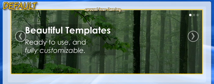
.carousel-inner .item img {}
The .carousel-inner .item img style set may be used to specify the style rules for the images in the slideshow.
example
.carousel-inner .item .img {
width: 100%;
}
This rules specifies that the width of the slideshow images will be the full width available within the slideshow container.
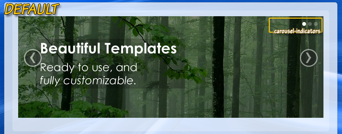
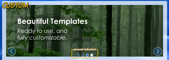
.carousel-indicators {}, .carousel-indicators li {}, .carousel-indicators li.active {}
The .carousel-indicators, .carousel-indicators li, and .carousel-indicators li.active style sets may be used to specify the style rules for the navigation bullets. The .carousel-indicators set refers to the entire list of navigation bullets, while .carousel-indicators li refers to each bullet within the list, and .carousel-indicators li.active refers to the bullet corresponding to the currently displayed image.
example
.carousel-indicators {
z-index: 5;
position: absolute;
top: 100%;
right: 0;
width: 100%;
margin: -15px 0 0 0;
list-style: none;
text-align: center;
}
.carousel-indicators li {
display: inline-block;
float: none;
height: 10px;
width: 10px;
margin-left: 5px;
border: 2px solid rgba(255,255,255,0.4);
border-radius: 50%;
background-color: rgba(16,88,190,0.4);
}
.carousel-indicators li:hover {
border-color: white;
background-color: rgb(16,88,190);
}
.carousel-indicators li.active {
border-color: white;
background-color: white;
}
The combination of these sets of rules specifies that the navigation bullets will be displayed centered at the bottom of the image slideshow instead of in the top right corner. Additionally, the bullets will be a semi-transparent blue, with a semi-transparent white border. If a bullet is moused over, it will become opaque. The bullet corresponding to the currently displayed image will also be opaque, and will have a white background instead of blue.
.carousel-control {}, .carousel-control.left {}, .carousel-control.right {}
The .carousel-control style set may be used to specify styles for the left and right arrow buttons. It is also possible to specify rules for just the left arrow button with the .carousel-control.left style set, or for just the right arrow button with the .carousel-control.right style set.
example
.carousel-control {
top: 100%;
left: 5px;
margin-top: -50px;
border: 3px solid white;
border-radius: 50%;
background: rgb(16,88,190);
opacity: 0.4;
filter: alpha(opacity=40);
}
.carousel-control.right {
right: 5px;
}
This combination of sets of rules specifies that the left and right arrow buttons should be displayed at the bottom of the slideshow, very close to the outer edges. The buttons should have a blue background and be semi-transparent.
The default rules that make the left and right arrow buttons opaque when moused over are not affected by these custom rules, so the buttons will still become opaque when moused over.
Using the examples above as a starting point, it is possible to customize the image slideshow that is included in responsive template packages.
regarding customized html templates
We're always happy to help when we can, but once a template's HTML code has been customized by a third party, troubleshooting those customizations falls outside of what Modular Merchant can provide within our range of free technical support.
Fixing larger template issues may require paid development time. We evaluate each request on a case-by-case basis. If a request is so large that it requires a custom web design project to resolve, we will always provide a proposal for the client's approval prior to performing any billable work.
|