The responsive template packages produced by Modular Merchant are designed using the Twitter Bootstrap "Fluid layout".
In order to customize the content and layout of the navigation header of a responsive template package, it is necessary to edit the HTML templates within that template package. If the only template in the package is the universal template, then customizations to that one template will automatically be applied to the entire storefront.
However, if the template package contains multiple templates, then each template must be edited individually in order to apply the same customizations to the entire storefront. For instance, a template package might contain universal.tpl and index.tpl. If the navigation header in universal.tpl is customized, but the navigation header in index.tpl is not customized, then the store's index page will continue to use the default navigation header, while all of the other storefront pages will use the custom navigation header from the universal template.
Common customizations for the navigation header include adding or removing options from the horizontal navigation menu, and adding or removing options from the customer account dropdown menu.
HTML code for the basic components of the nav header
Responsive template packages designed by Modular Merchant typically use very similar code for the navigation header. The navigation header generally includes four basic elements:
-
The company name, which is typically a link to the store home page.
-
A horizontal navigation menu, containing the store home icon, and links to the track shipment page, the basket page, and the checkout page.
-
The customer account menu, which either displays a link to login to the customer account area; or if the customer is already logged in, contains a welcome message and a dropdown menu with links to the customer account area and to log out.
-
A button to expand or collapse the navigation menu on small screens. On small screens, the expand/collapse button is shown at the right of the nav header, and the company name is shown at the left.
example <!-- TOP NAVIGATION MENU -->
<div class="navbar navbar-inverse navbar-fixed-top">
<div class="navbar-inner">
<div class="container-fluid">
<button type="button" class="btn btn-navbar" data-toggle="collapse" data-target=".nav-collapse">
<span class="icon-bar"></span>
<span class="icon-bar"></span>
<span class="icon-bar"></span>
</button>
<a class="brand" href="index.php">{COMPANY-NAME}</a>
<div class="nav-collapse collapse">
{IF-CUSTOMER-LOGGED-IN-BEGIN}
<div class="btn-group pull-right">
<a class="btn btn-mini" href="customers/" title="View Your Account"><i class="icon-user"></i> Welcome, {CUSTOMER-BILL-FIRST-NAME}</a>
<a class="btn btn-mini dropdown-toggle" data-toggle="dropdown" href="#" title="Options"><span class="caret"></span></a>
<ul class="dropdown-menu">
<li><a href="customers/"><i class="icon-user"></i> My Account Area</a></li>
<li class="divider"></li>
<li><a href="{URL-LOG-OUT}"><i class="icon-off"></i> Log Out</a></li>
</ul>
</div>
{ELSE}
<!-- Button to trigger modal -->
<p class="navbar-text pull-right">
<a href="#log_in_modal" role="button" data-toggle="modal">Log In</a>
</p>
{IF-CUSTOMER-LOGGED-IN-END}
<ul class="nav">
<li><a href="index.php" title="Store Home"><i class="icon-home icon-white"></i></a></li>
<li><a href="track_shipment.php">Track Shipment</a></li>
<li><a href="basket.php">View Cart ({NUMBER-BASKET-ITEMS} items)</a></li>
<li><a href="checkout/" class="HIGHLIGHT-TEXT">Checkout</a></li>
</ul> </div><!--/.nav-collapse -->
</div>
</div>
</div>
typical default expand/collapse button
<button type="button" class="btn btn-navbar" data-toggle="collapse" data-target=".nav-collapse">
<span class="icon-bar"></span>
<span class="icon-bar"></span>
<span class="icon-bar"></span>
</button>
The button to expand/collapse the navigation menu on small screens typically consists of a button element which contains three span elements. Each span element has the style class "icon-bar", which which displays a white bar icon.
The button might be customized by replacing the three span elements with something else, such as the text "Menu".
example customized expand/collapse button
<button type="button" class="btn btn-navbar" data-toggle="collapse" data-target=".nav-collapse">
Menu
</button>
Company name
typical default company name link
The company name that links to the store home page consists simply of an anchor element with the style class "brand" and with the href attribute "index.php". The link text is generated by the {COMPANY-NAME} QuickCode Tag.
This content might be customized by removing the element from the nav header altogether, by changing the href attribute to point to a different URL, or replacing {COMPANY-NAME} with some other text.
example customized company name link
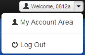
typical default customer account menu
{IF-CUSTOMER-LOGGED-IN-BEGIN}
<div class="btn-group pull-right">
<a class="btn btn-mini" href="customers/" title="View Your Account"><i class="icon-user"></i> Welcome, {CUSTOMER-BILL-FIRST-NAME}</a>
<a class="btn btn-mini dropdown-toggle" data-toggle="dropdown" href="#" title="Options"><span class="caret"></span></a>
<ul class="dropdown-menu">
<li><a href="customers/"><i class="icon-user"></i> My Account Area</a></li>
<li class="divider"></li>
<li><a href="{URL-LOG-OUT}"><i class="icon-off"></i> Log Out</a></li>
</ul>
</div>
{ELSE}
<!-- Button to trigger modal -->
<p class="navbar-text pull-right">
<a href="#log_in_modal" role="button" data-toggle="modal">Log In</a>
</p>
{IF-CUSTOMER-LOGGED-IN-END}
If the current visitor is not logged in to a customer account, the default nav header displays a "Log In" link.
If the current visitor is logged into a customer account, the default nav header displays a welcome button that the customer may click to view the customer account area. To the right of the welcome button is a down arrow button that may be used to toggle the customer account dropdown menu.
A typical default customer account dropdown menu consists of a link to the customer account area, and a "Log Out" link.
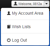
Some common customizations to the customer account menu include changing the "Log In" link to load the full customer login page instead of the login modal popup; changing the text of the primary customer account button; and adding or removing options from the customer account dropdown menu.
In the example below, a link to the store's wish lists page has been added to the customer account dropdown menu, and the "Log In" link has been edited to load the customer login page instead of the customer login modal popup.
example customized customer account menu
{IF-CUSTOMER-LOGGED-IN-BEGIN}
<div class="btn-group pull-right">
<a class="btn btn-mini" href="customers/" title="View Your Account"><i class="icon-user"></i> Welcome, {CUSTOMER-BILL-FIRST-NAME}</a>
<a class="btn btn-mini dropdown-toggle" data-toggle="dropdown" href="#" title="Options"><span class="caret"></span></a>
<ul class="dropdown-menu">
<li><a href="customers/"><i class="icon-user"></i> My Account Area</a></li>
<li class="divider"></li>
{IF-USING-WISH-LISTS-BEGIN}
<li><a href="wish_list.php"><i class="icon-book"></i> Wish Lists</a></li>
<li class="divider"></li>
{IF-USING-WISH-LISTS-END}
<li><a href="{URL-LOG-OUT}"><i class="icon-off"></i> Log Out</a></li>
</ul>
</div>
{ELSE}
<!-- Button to trigger modal -->
<p class="navbar-text pull-right">
<a href="customer_login.php">Log In</a>
</p>
{IF-CUSTOMER-LOGGED-IN-END}
typical default navigation menu
<ul class="nav">
<li><a href="index.php" title="Store Home"><i class="icon-home icon-white"></i></a></li>
<li><a href="track_shipment.php">Track Shipment</a></li>
<li><a href="basket.php">View Cart ({NUMBER-BASKET-ITEMS} items)</a></li>
<li><a href="checkout/" class="HIGHLIGHT-TEXT">Checkout</a></li>
</ul>
By default, the top navigation menu contains a store home icon that links to the store home page, as well as links to the track shipment page, the basket page, and the checkout page. On small screens, the navigation menu becomes a vertical list contained in an expandable/collapsible area below the store name and navigation menu button.
Common customizations to this content include removing any of the default links, or adding different links that are more relevant to a particular store.
In the example below, the "Track Shipment" link has been removed, and a new link to the store's events page has been added.
example customized navigation menu
<ul class="nav">
<li><a href="index.php" title="Store Home"><i class="icon-home icon-white"></i></a></li>
<li><a href="events.php">Sales & Specials</a></li>
<li><a href="basket.php">View Cart ({NUMBER-BASKET-ITEMS} items)</a></li>
<li><a href="checkout/">Checkout</a></li>
</ul>
Customize the appearance of the navigation header
In addition to customizing the content of the navigation header, it is possible to customize the appearance of the navigation header. Altering the appearance of the navigation header is accomplished by editing the template package's CSS files, and is explained in detail in the following Knowledge Base article:
Customize the appearance of the navigation header of a responsive template package
regarding customized html templates
We're always happy to help when we can, but once a template's HTML code has been customized by a third party, troubleshooting those customizations falls outside of what Modular Merchant can provide within our range of free technical support.
Fixing larger template issues may require paid development time. We evaluate each request on a case-by-case basis. If a request is so large that it requires a custom web design project to resolve, we will always provide a proposal for the client's approval prior to performing any billable work.
|


